
Ankush Ananth Bhat
25 January 2025
The Problem Every Frontend Dev Knows
You've got a new feature to build. It needs a data table with sorting, a modal with a form inside, some toast notifications, and a date picker. You could wire all of that up from scratch — or you could be done in an afternoon.
That's the promise of Ant Design (AntD): a battle-tested, enterprise-grade React component library that gives you everything you'd spend weeks building, right out of the box.
Used by teams at Alibaba, Tencent, Baidu, and thousands of companies worldwide, AntD isn't just a UI kit — it's a complete design system with consistent spacing, color, typography, and interaction patterns built into every component.
Getting Started
npm install antd
// main.jsx or index.js — import the stylesheet once
import 'antd/dist/reset.css';
That's your entire setup. No theme configuration required to get started.
import { Button, DatePicker, Space } from 'antd';

export default function App() {
  return (
    <Space>
      <Button type="primary">Get Started</Button>
      <DatePicker />
    </Space>
  );
}
You just rendered a pixel-perfect button and date picker with hover states, focus rings, and keyboard accessibility — without writing a single line of CSS.
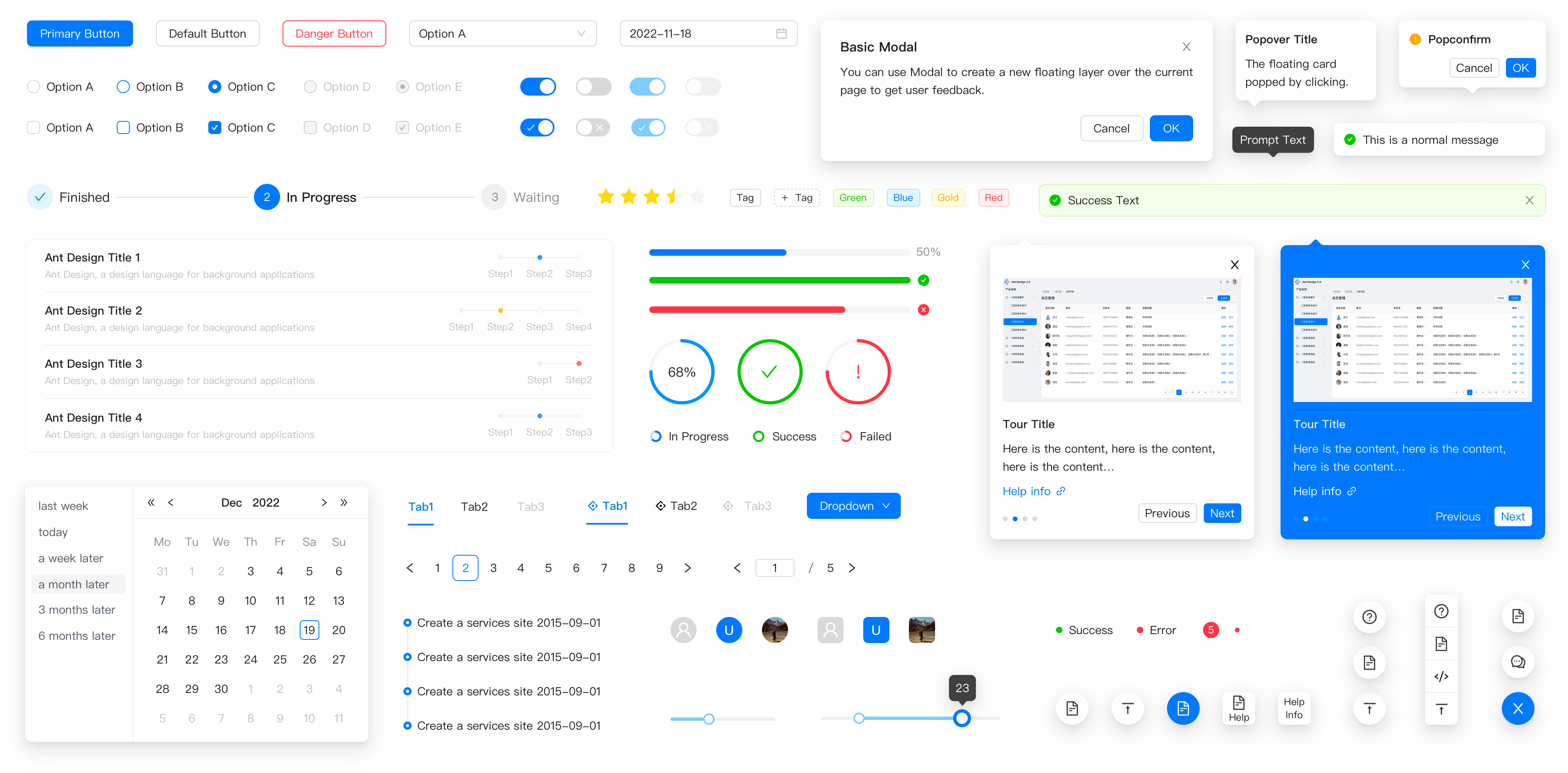
What's in the Box
Ant Design ships 60+ components across every category you'll encounter in a real app:
Layout
| Component | Use Case |
|---|---|
Layout |
App shell with Header, Sider, Content, Footer |
Grid |
24-column responsive grid system |
Space |
Consistent gap between inline elements |
Divider |
Section separators |
Navigation
| Component | Use Case |
|---|---|
Menu |
Sidebar and top navigation with nested items |
Breadcrumb |
Page hierarchy trail |
Tabs |
Tabbed content panels |
Pagination |
Page-through large datasets |
Data Entry
| Component | Use Case |
|---|---|
Form |
Validation, layout, field binding |
Input |
Text, password, textarea, search |
Select |
Dropdown with search and multi-select |
DatePicker |
Single date, range picker, time picker |
Upload |
Drag-and-drop or click-to-upload |
Checkbox / Radio |
Single and grouped selections |
Slider |
Range input with marks |
Data Display
| Component | Use Case |
|---|---|
Table |
Sortable, filterable, paginated data tables |
List |
Virtualized or standard lists |
Card |
Content containers with headers and actions |
Tag |
Status labels and category chips |
Badge |
Notification counts on icons |
Avatar |
User images with fallback initials |
Statistic |
Bold KPI numbers with labels |
Timeline |
Ordered event sequences |
Feedback
| Component | Use Case |
|---|---|
Modal |
Dialogs and confirmations |
Drawer |
Slide-in side panels |
Notification |
Toast messages (top-right) |
Message |
Inline feedback banners |
Alert |
Inline status blocks |
Spin / Skeleton |
Loading states |
Progress |
Bars, circles, steps |
The Components That Save the Most Time
1. Table — Your Best Friend for Dashboards
AntD's Table is arguably the most feature-complete table component in any library. Sorting, filtering, pagination, row selection, expandable rows — all configuration, no custom code.
import { Table, Tag } from 'antd';

const columns = [
  {
    title: 'Name',
    dataIndex: 'name',
    sorter: (a, b) => a.name.localeCompare(b.name),
  },
  {
    title: 'Status',
    dataIndex: 'status',
    filters: [
      { text: 'Active', value: 'active' },
      { text: 'Inactive', value: 'inactive' },
    ],
    onFilter: (value, record) => record.status === value,
    render: (status) => (
      <Tag color={status === 'active' ? 'green' : 'red'}>
        {status.toUpperCase()}
      </Tag>
    ),
  },
  {
    title: 'Joined',
    dataIndex: 'joinDate',
    sorter: (a, b) => new Date(a.joinDate) - new Date(b.joinDate),
  },
];

const data = [
  { key: '1', name: 'Arjun Mehta', status: 'active', joinDate: '2023-01-15' },
  { key: '2', name: 'Priya Sharma', status: 'inactive', joinDate: '2022-08-20' },
];

export default function UsersTable() {
  return <Table columns={columns} dataSource={data} pagination={{ pageSize: 10 }} />;
}
A fully functional, sortable, filterable, paginated table — in under 40 lines.
2. Form — Validation Without the Headache
AntD's Form component handles field registration, validation rules, error messages, and submission state — all without a third-party form library.
import { Form, Input, Button, Select } from 'antd';

const { Option } = Select;

export default function RegisterForm() {
  const [form] = Form.useForm();

  const onFinish = (values) => {
    console.log('Submitted:', values);
  };

  return (
    <Form form={form} layout="vertical" onFinish={onFinish}>
      <Form.Item
        name="email"
        label="Email"
        rules={[
          { required: true, message: 'Email is required' },
          { type: 'email', message: 'Enter a valid email' },
        ]}
      >
        <Input placeholder="you@example.com" />
      </Form.Item>

      <Form.Item
        name="role"
        label="Role"
        rules={[{ required: true, message: 'Please select a role' }]}
      >
        <Select placeholder="Select a role">
          <Option value="admin">Admin</Option>
          <Option value="editor">Editor</Option>
          <Option value="viewer">Viewer</Option>
        </Select>
      </Form.Item>

      <Form.Item
        name="password"
        label="Password"
        rules={[
          { required: true },
          { min: 8, message: 'Password must be at least 8 characters' },
        ]}
      >
        <Input.Password />
      </Form.Item>

      <Form.Item>
        <Button type="primary" htmlType="submit" block>
          Register
        </Button>
      </Form.Item>
    </Form>
  );
}
Built-in validation, error display, field binding, and accessible labels — no react-hook-form or formik needed for standard use cases.
3. Layout — Entire App Shell in Minutes
import { Layout, Menu, theme } from 'antd';
import {
  DashboardOutlined,
  UserOutlined,
  SettingOutlined,
} from '@ant-design/icons';

const { Header, Sider, Content } = Layout;

export default function AppShell() {
  const { token } = theme.useToken();

  return (
    <Layout style={{ minHeight: '100vh' }}>
      <Sider collapsible>
        <Menu
          theme="dark"
          mode="inline"
          defaultSelectedKeys={['dashboard']}
          items={[
            { key: 'dashboard', icon: <DashboardOutlined />, label: 'Dashboard' },
            { key: 'users', icon: <UserOutlined />, label: 'Users' },
            { key: 'settings', icon: <SettingOutlined />, label: 'Settings' },
          ]}
        />
      </Sider>
      <Layout>
        <Header style={{ background: token.colorBgContainer }} />
        <Content style={{ margin: '24px', padding: '24px', background: token.colorBgContainer }}>
          {/* Your page content */}
        </Content>
      </Layout>
    </Layout>
  );
}
Collapsible sidebar, themed header, content area — a full admin shell with responsive collapse behavior, done in one component tree.
Theming: Make It Yours
AntD v5 ships with a CSS-in-JS token system that replaces the old LESS variable approach. You can override any design token — colors, border radius, font size, spacing — at the app level.
import { ConfigProvider } from 'antd';

export default function App() {
  return (
    <ConfigProvider
      theme={{
        token: {
          colorPrimary: '#6C5CE7',       // your brand color
          borderRadius: 8,
          fontFamily: "'DM Sans', sans-serif",
        },
        components: {
          Button: {
            colorPrimary: '#6C5CE7',
            algorithm: true,             // auto-generates hover/active states
          },
          Table: {
            headerBg: '#f0f0ff',
          },
        },
      }}
    >
      {/* Entire app inherits the theme */}
    </ConfigProvider>
  );
}
One ConfigProvider at the root propagates your brand identity to every single component — no component-level CSS overrides needed.
Pro Tips for Working with AntD
Tip 1: Use the useMessage hook for notifications
import { App } from 'antd';

// Wrap once at root
<App>
  <YourApp />
</App>

// Use anywhere inside
const { message, notification, modal } = App.useApp();

message.success('Saved successfully!');
notification.error({ message: 'Upload failed', description: 'File too large.' });
modal.confirm({ title: 'Delete this record?', onOk: handleDelete });
Tip 2: Pair with @ant-design/icons
npm install @ant-design/icons
import { SearchOutlined, PlusCircleFilled, LoadingOutlined } from '@ant-design/icons';

<Button icon={<PlusCircleFilled />} type="primary">
  New Record
</Button>
Over 780 icons available, tree-shakeable, sized via style prop.
Tip 3: Use Skeleton for every loading state
import { Skeleton, Card } from 'antd';

function UserCard({ loading, user }) {
  return (
    <Card>
      <Skeleton loading={loading} avatar active>
        <h3>{user.name}</h3>
        <p>{user.email}</p>
      </Skeleton>
    </Card>
  );
}
Tip 4: Lazy-import heavy components
Some AntD components (like DatePicker) pull in locale data. Lazy-load them for better bundle performance:
import React, { lazy, Suspense } from 'react';

const DatePicker = lazy(() => import('antd/es/date-picker'));

function MyForm() {
  return (
    <Suspense fallback={<div>Loading...</div>}>
      <DatePicker />
    </Suspense>
  );
}
AntD vs Other Libraries
| Ant Design | Material UI | Shadcn/ui | Chakra UI | |
|---|---|---|---|---|
| Component count | 60+ | 50+ | 40+ | 50+ |
| Built-in Table | ✅ Advanced | ❌ Basic | ❌ | ❌ |
| Built-in Form validation | ✅ | ❌ | ❌ | ❌ |
| Design system | Enterprise | Material | Headless | Accessible |
| Theming | Token-based | Emotion | CSS vars | Token-based |
| Best for | Dashboards, admin panels | Consumer apps | Custom design | Accessible UIs |
AntD wins hardest on data-heavy admin and dashboard UIs. If you're building a CMS, ERP, internal tool, or analytics panel — it's the fastest path from wireframe to shipped.
When Not to Use AntD
AntD has opinions — strong ones. That's a feature in most cases, but a constraint when:
- You need a highly custom visual identity that diverges from AntD's aesthetic
- You're building a marketing or landing page (too heavy, wrong vibe)
- Bundle size is critical — AntD's full build is ~2MB (though tree-shaking reduces this significantly)
For those cases, consider Shadcn/ui (fully headless, bring your own styles) or Radix UI (accessible primitives, zero styles).
Wrapping Up
Ant Design doesn't just give you components — it gives you consistency, accessibility, and a design language that holds up at scale. The time you save not re-building tables, forms, and modals gets reinvested into the features that actually differentiate your product.
For any React developer building dashboards, admin panels, or internal tools, AntD is one of the highest-leverage dependencies you can add.
Install it once. Ship faster, forever.
Already using AntD in a project? Share what component you reach for first — mine is always Table. Drop an email.